Philadelphia Parks Alliance
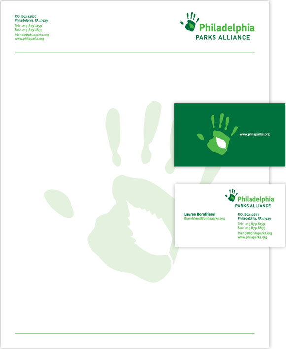
Philadelphia Parks Alliance wanted to be seen as more of an action and advocacy group, than a "tree-hugger" organization. Their identity needed to speak to action and activity while remaining subtle and rational.
Paul Tripp Ministries
Paul Tripp Ministries needed an identity that was conservative in an elegant stylistic way, not a political or social way. Their logo needed to be stylish but rational and reserved at the same time.

Spellbound
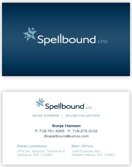
Spellbound was initially focussed specifically on music retail, but had branched out into both jewelry and electronics. At the same time they had shifted from being a retail store, to being a management company with a number of stores. Their logo needed to be classy and fun, but vague enough that it wasn't limiting.
Thai Me Up
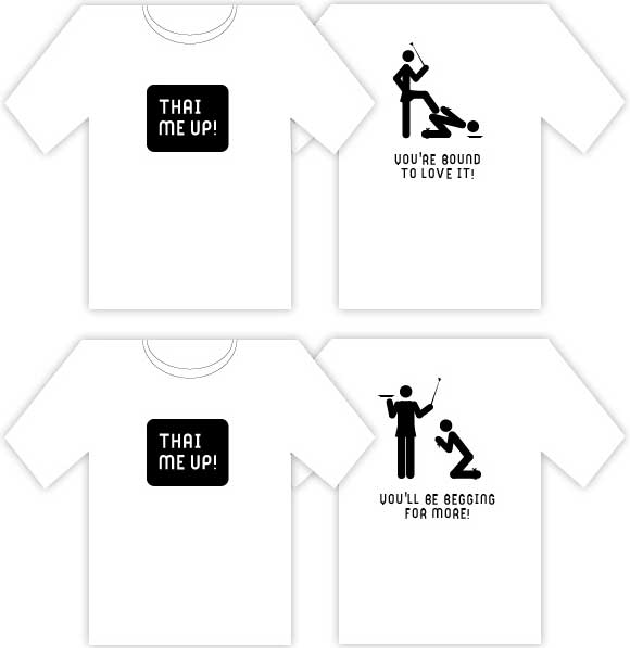
Thai Me Up is a restaurant with a fun, vivacious atmosphere. They needed their identity to be simple, and fun, but wanted their name to speak for itself as far as the logo was concerned. This left plenty of room for humor in other areas.
Unreal Marketing
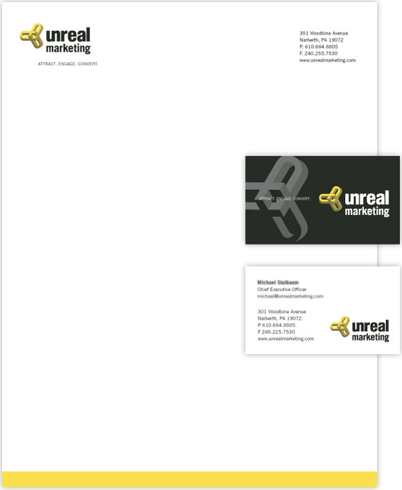
Unreal Marketing needed to reinvigorate and modernize their brand. Their identity makes playful use of their name by pairing it with an impossible shape. The brand needed to position them as modern and innovative in a competitive business.
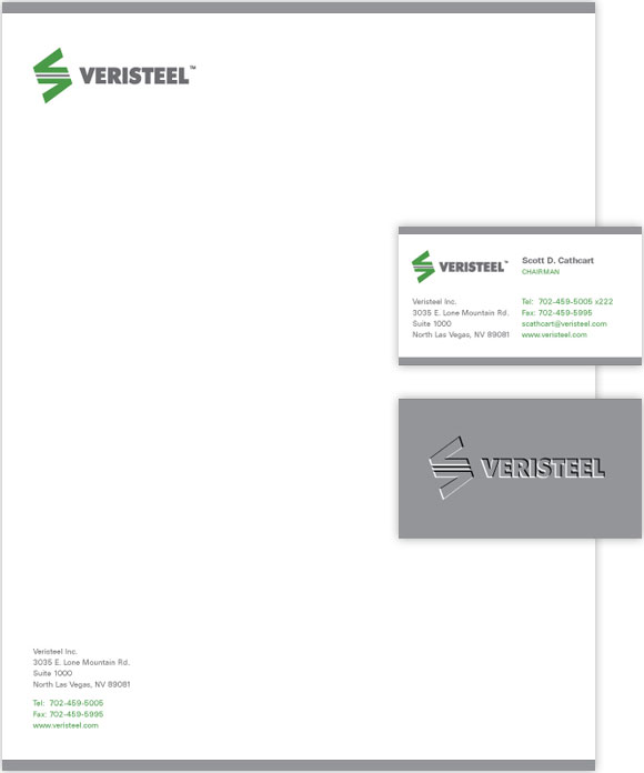
Veristeel
Veristeel makes steel beams that are lightweight but heavy duty, by utilizing a "hollow" design with a variety of reinforcements. Their identity needed to look as solid as their product while evoking a progressive sensibility.
Wireless Central
Wireless Central needed an identity that was unmistakably communications oriented, but also fun and friendly. The identity needed to be able to flex to hold either a simple message or a group of more complex messages, and deliver them with punch.
